Role
Lead UX engineer
Team
1 accessibility specialist, 2 UX engineers, 2 UX designers
Company
Cisco
Overview
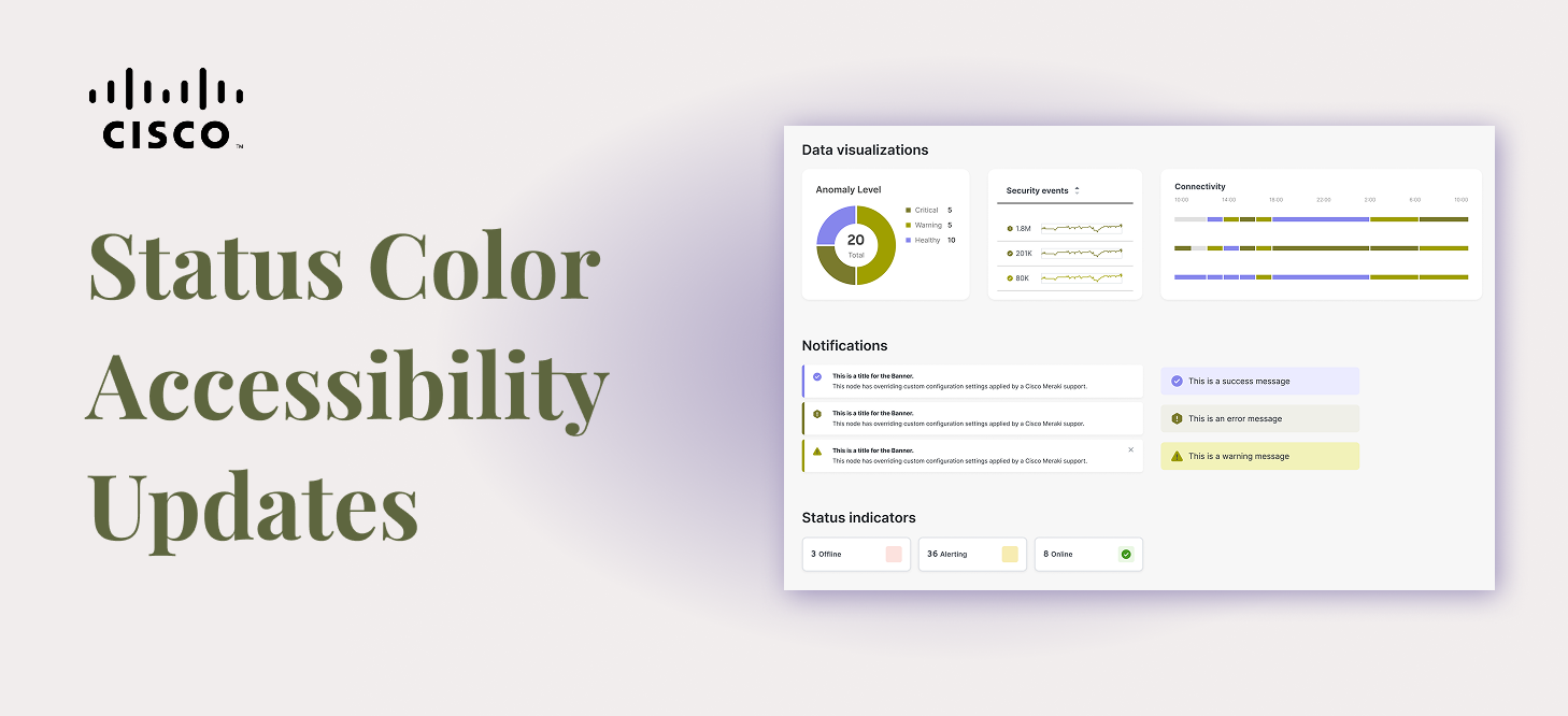
Color Vision Deficiency (CVD) affects 1 in 12 men and 1 in 200 women worldwide. The most common form is red/green color blindness, which makes it difficult or impossible to distinguish red from green. For a design system powering technical dashboards where status colors carry critical meaning, that is a serious problem.
Cisco’s Magnetic design system followed the industry convention of green for success and red for failure. When simulated through a red/green CVD filter, the difference between a healthy system and a failed one nearly disappeared. For users managing network infrastructure, security events, and system health, that ambiguity is not a minor inconvenience. It is a real risk.
The Problem
Status communication in Magnetic was built entirely around red and green. Success, failure, warning, and danger states across dashboards, notifications, connectivity charts, and port connections all relied on a user’s ability to tell those two colors apart. A user with red/green color blindness looking at a port connections panel or an anomaly chart had to rely on labeling to distinguish a healthy state from a critical one.
The broader industry response to this kind of accessibility gap has typically been to offer an accessibility mode, similar to how products offer a dark mode toggle. We pushed back on that approach. Accessibility should be the default, not a setting users have to find and turn on.
Research and Design Direction
Our accessibility lead ran research testing multiple color combinations with users who have color vision deficiency. The team tested various shades of red and green, teal-leaning greens, and blue. Blue consistently performed the best, giving users a clear and reliable way to distinguish a positive state from a negative one across various types of CVD.
Sentiment research added important nuance. Users did not associate blue as strongly with success the way they associated green, but they did not find it negative either. Most described it as neutral or okay.
Since blue was already in use as the info status color, the updated system moved info to purple, keeping the full status palette distinct and meaningful across all users.
My Role: Engineering the Transition
I led the engineering implementation of the color updates across the Magnetic design system. The automated design token pipeline we had built meant that updates made in Token Studio automatically propagated to Figma styles, Figma variables, and all code style outputs. The color changes went out consistently across every platform and format the system supports.
The update shipped as a major version bump in the npm package, making the breaking nature of the change explicit and expected. Changes were communicated a full quarter in advance to give teams adequate time to plan.
Migration Challenges
Getting the colors right was the straightforward part. Getting them out to a large, distributed organization without breaking things was considerably more complex.
A system mid-transition
Many teams were still in the process of adopting Magnetic when this change landed. Apps across the organization had partially hardcoded styles sitting alongside design system tokens, what amounted to Frankenstein files where some values came from the system and others were manually set. For those teams, a token update would only fix part of the problem. The rest required their own engineers to manually hunt down hardcoded color values.
Design and code out of sync
Designers could swap to the new colors in Figma immediately. Code updates required teams to upgrade their packages. That gap meant product teams would be temporarily working with designs that did not match their implementation, a frustrating but unavoidable reality of a change at this scale.
Downstream documentation and user-facing content
Red and green were not just used in UI components. They appeared in illustrations, documentation, and user-facing content across the organization. Teams needed time to audit and update all of those surfaces, which went well beyond a package upgrade.
Introducing the first new theme
To give teams a supported path forward without forcing an immediate breaking change, I proposed renaming the original color scheme to Magnetic Classic, preserving it as a fully maintained theme alongside the new accessible default. That meant introducing Magnetic Classic Light and Magnetic Classic Dark as new themes within the existing pipeline. This was the first time we had added a theme to the system, so we had to work through how the new themes would interact with the token engine, the Style Dictionary pipeline, and the Figma variable structure before we could ship. It added complexity but established a pattern we could use for future theme additions.
Impact
Magnetic’s status colors are now accessible by default for users with red/green color vision deficiency, without requiring them to opt into a separate mode. Teams that needed more time to transition had a clear and supported path through Magnetic Classic. The update demonstrates that accessible design at scale does not have to mean asking users to do extra work to get an experience that works for them.
Reflection
The most meaningful part of this project was the decision not to make accessibility a toggle. That conviction came from the design and accessibility team, and my job as the engineer was to make sure the implementation honored it fully. Getting the migration strategy right mattered just as much as getting the colors right. A good decision poorly executed still leaves people behind.